IThub College Homepage
$150
3 days

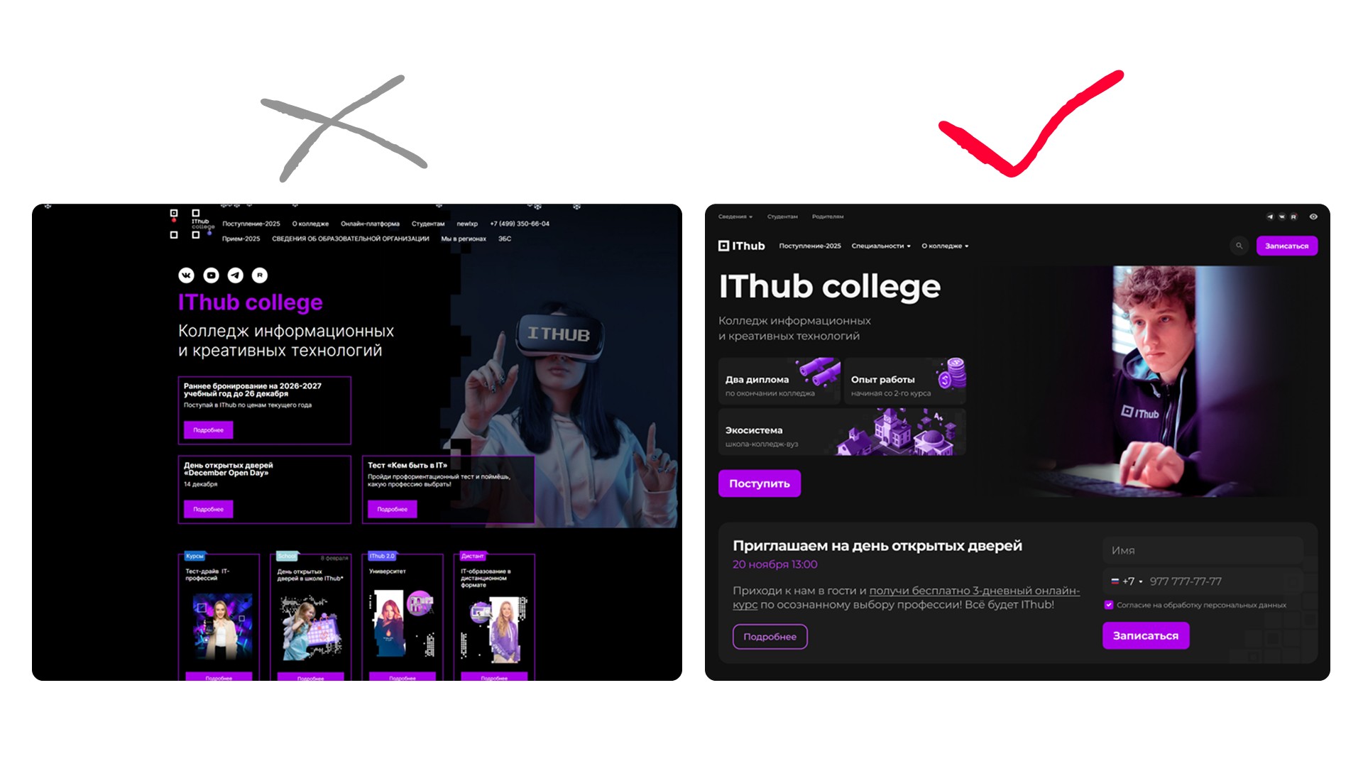
While public universities are creating digital bulletin boards from the 2000s, we make interfaces that sell. If a college website looks worse than a success course landing page, you're losing a prospective student in 3 seconds.
The project aimed to transform the educational institution into a place that's appealing to invest in.
Given: a commercial college with ambitions, but lacking clear positioning and featuring an outdated landing page.
Problem: audience conflict. The site must appeal to teenagers as the target audience, yet parents, the decision-makers, pay the bills. The current visuals were childish, and the content bureaucratic.
Objective: a visual concept that sells the college as an IT startup.
Jobs To Be Done
We're dealing with two opposing psychological types on the same screen. Satisfying everyone means creating a dull mass. We separated the streams visually and contextually.
Teenagers don't care about federal educational standards. They want vibe, community, and to feel like characters from Mr. Robot.
Solution: dark theme, neon palette, 3D mascots, and a cyberpunk aesthetic.
Parents don't care about neon; they want assurances, diplomas, and investment security.
Visual Architecture
We moved away from low-quality real photos that cheapened the brand.
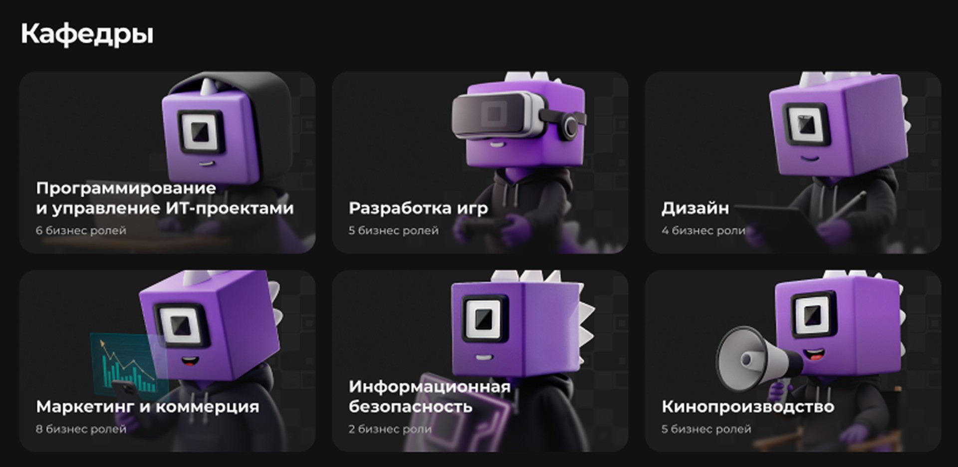
Instead, we implemented AI generation and 3D assets for the college mascot.
Rather than generic photos of cheerful teens from juice packaging, we added real photos of the college.
This set a quality standard that the client must now match in their own content.
Designing and Handling Objections
The main pain of paid education is the cost of tuition.
Seeing a price tag of 60,000 RUB/month and leaving is a typical parent scenario. We intercepted this scenario.
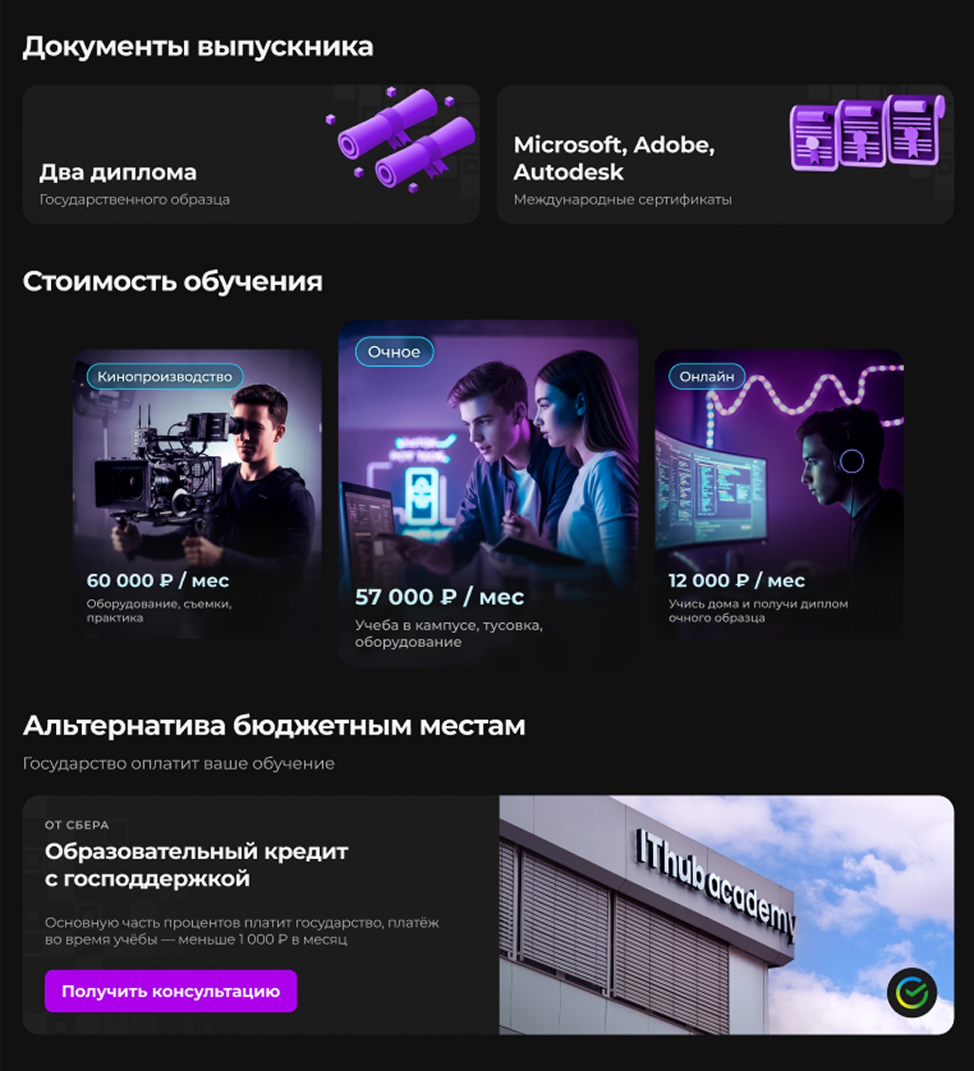
Instead of an Excel price list, we created tariff cards with color coding.
We introduced the Educational Loan block right after the price.
We don't apologize for charging and offer a solution. We turn burdensome expenses into smart investments in the future.
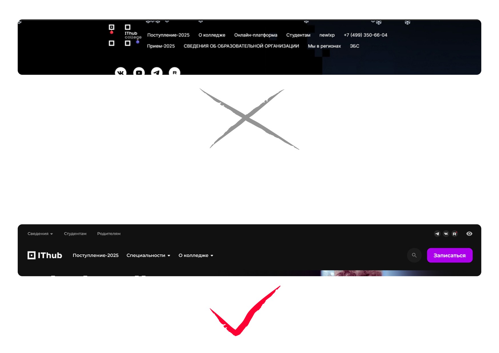
Navigation Cleanup
We eliminated bureaucracy and replaced a mess of links with a two-level short menu with a dropdown list.
The search feature was minimized into an icon, freeing up 20% of the screen's useful space for content.
Conclusion
The client received a concept at the level of top studios for a freelance budget. The college website looks like a Netflix interface, not like a government services portal. The design was accepted without subjective taste complaints, because every decision was justified by money and user psychology.